Nomad - Pacific Northwest Palette
Welcome to the "indie" eyeshadow world. Nomad Cosmetics released the Pacific Northwest palette in 2025. As a long time makeup enthusiast it's a shame this is my first indie palette. The term "indie" in beauty, refers to small privately owned businesses that are typically not available in stores and, are often self funded by the owners. Though these brands may use factories around the world to help bring their vision to life, the result is never before seen works of art.
Making the decision to shop small when it comes to makeup can be difficult. You can't swatch these in store before buying and, the return policy might not be as generous or as easy as shopping a retailer like Sephora. Hopefully, blogs like mine can help you see the honest to goodness quality and innovation and, sway the way you vote with your dollar. I promise you will be pleasantly surprised.
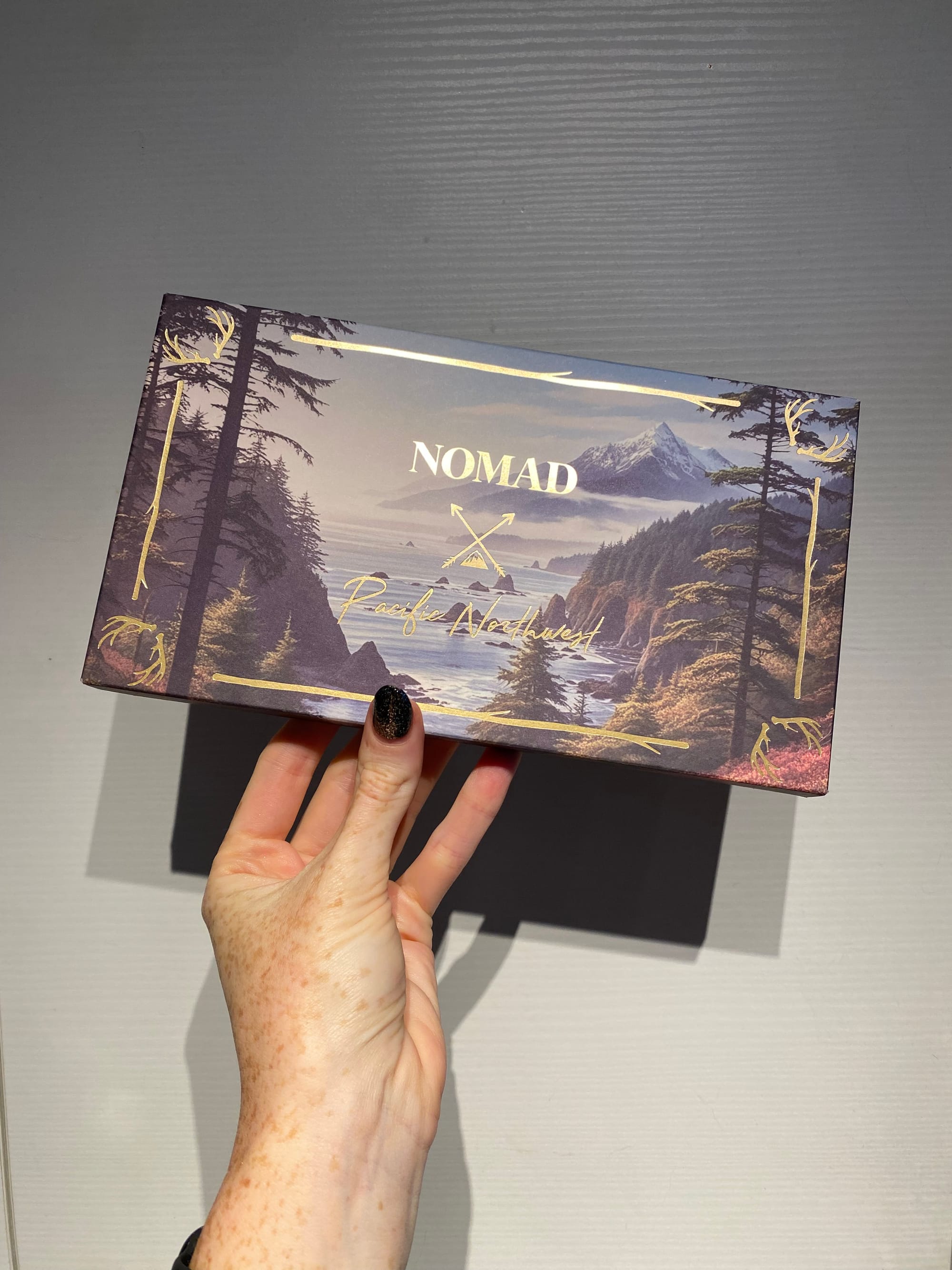
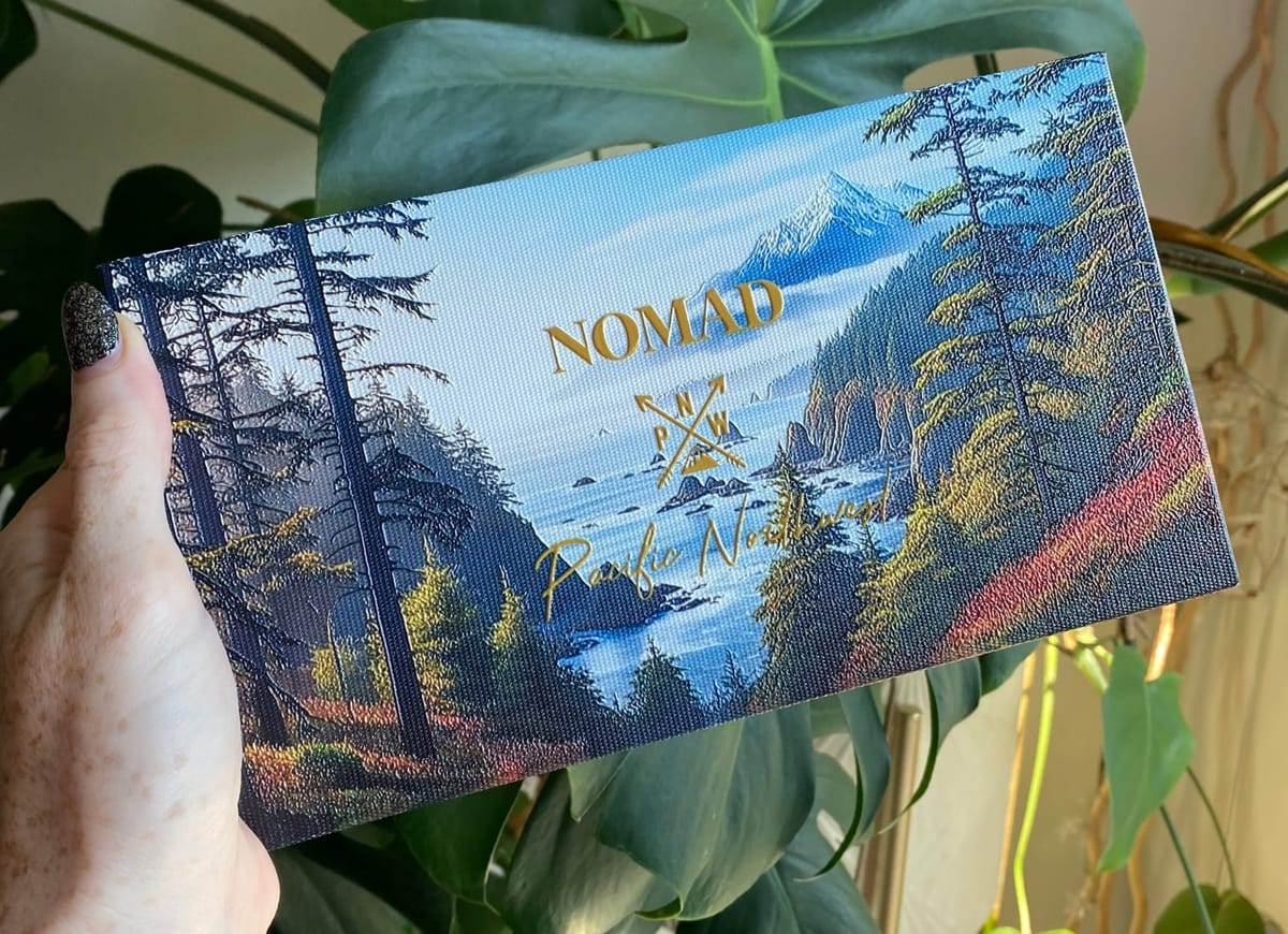
Outer box for the PNW palette.
Value Breakdown
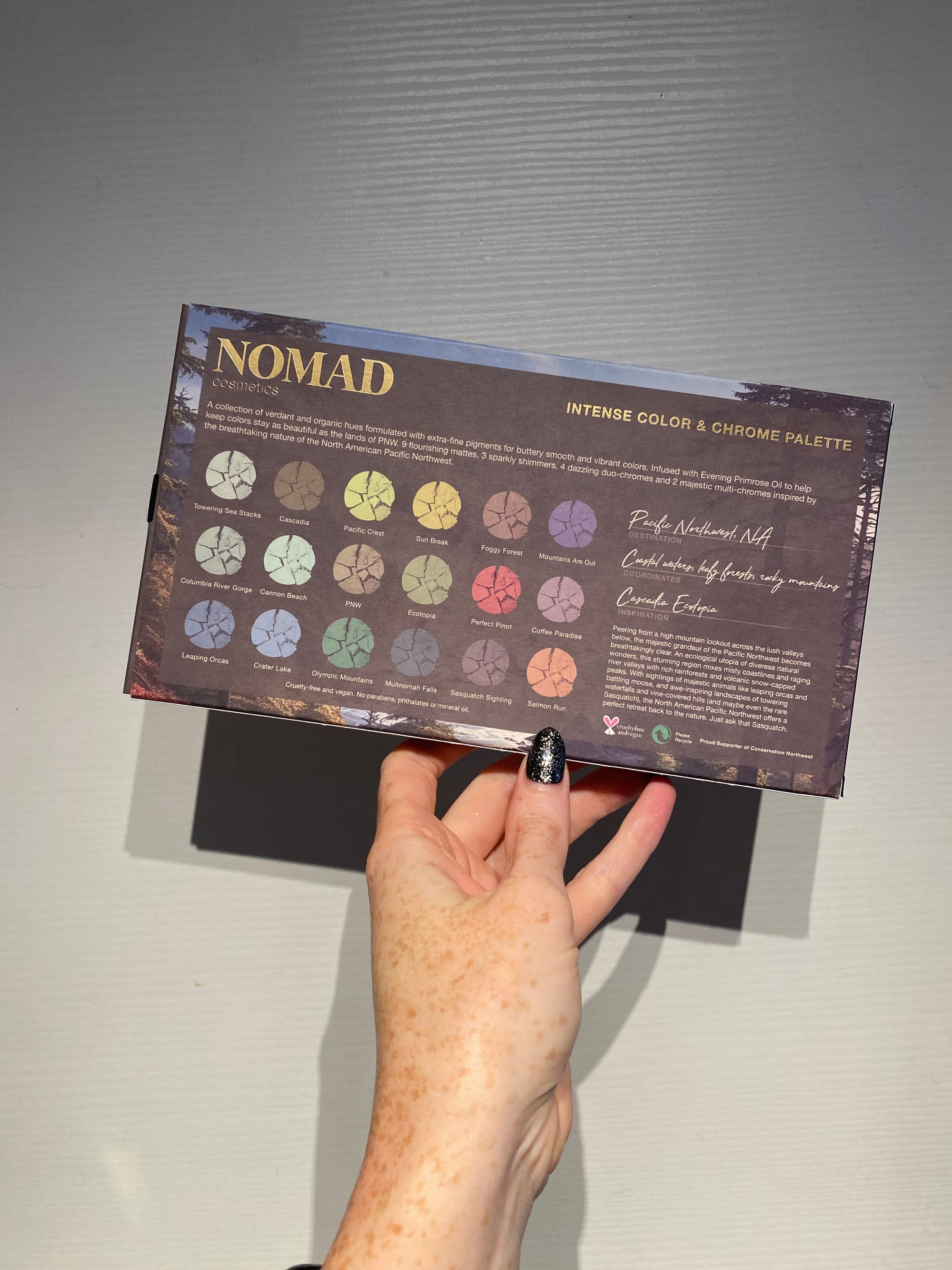
$59.00 USD for 18 shades ($3.27 per 0.05oz shadow, 1.5g total)
Compared to commercial palettes like Hung Vanngo this is a screaming deal and, better shadow quality. The color range, while mostly blue and green still shows contrast and an impressive array of special shades. The PNW palette features 9 mattes, 3 shimmers, 4 duo-chromes and, 2 multi-chromes. A dazzling variety. The palette also includes a very large mirror on the inside, something not as common in many brands today. I do my makeup at a vanity but the mirror makes this appealing for travel despite the large palette size.
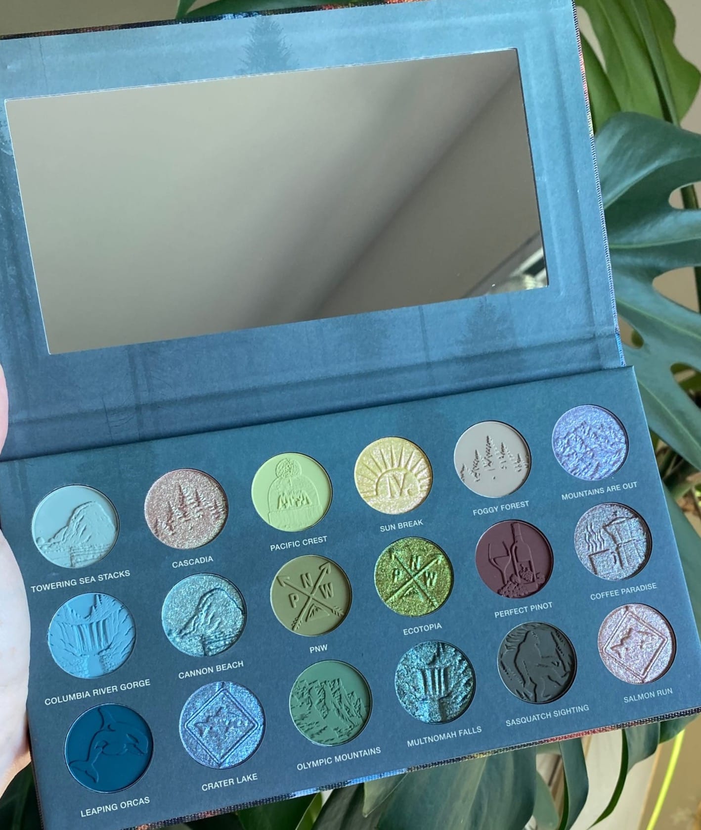
Upon opening the Nomad PNW palette, I was blown away. Each shadow has a unique stamp on the shadow. The designs are intricate and beautiful, it's a shame to slowly erode the images for a makeup look. This temporary detail is something that added such an artisan and high value feel to the palette. I love ephemeral artwork so, these embossments speak to me on a soul level.
The only thing I don't love about the packaging is the paper inner. There's often liquid in my vanity space and I worry that if this palette were to get wet or a drop of water where to fall on it, the palette may become water stained or warped. Everything else is fantastic.
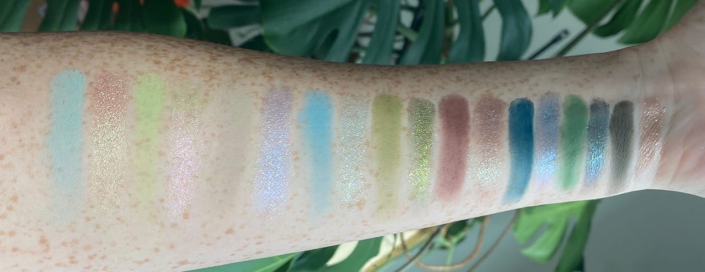
Swatches
I can be hard to impress and, I had no expectations going into using these shadows. Typically I'll swatch first then use a palette for a look but, I was so excited, I tried these on my eyes first. It's easy to make a shadow look good in swatches but how a shadow blends out on the eye is a different game. I'll show my swatches first then eye looks to follow in the performance section. First take a look at all 18 shades and take a moment to appreciate the embossments and shade names. If you've never been to the Pacific Northwest I'll leave some notes on why the shade names are so cool.
Untouched shadow pans with custom embossments.
Like I said I wasn't expecting much of anything and these came though. Swatches are done on dry skin, no primer, shown in natural light. The color range from light to dark is exactly what I'm looking for in a palette. Options for transitions, crease, liner, and lid colors are abundant in the PNW color story.
Since there are so many shades in this palette I'll break them into three sections by row, top to bottom. I feel the way this palette was laid out was very intentional. Light airy colors to the top like the mist that hangs high in the tree tops, Darker more robust colors lower in the ecosystem bringing richness and dimension to the story.
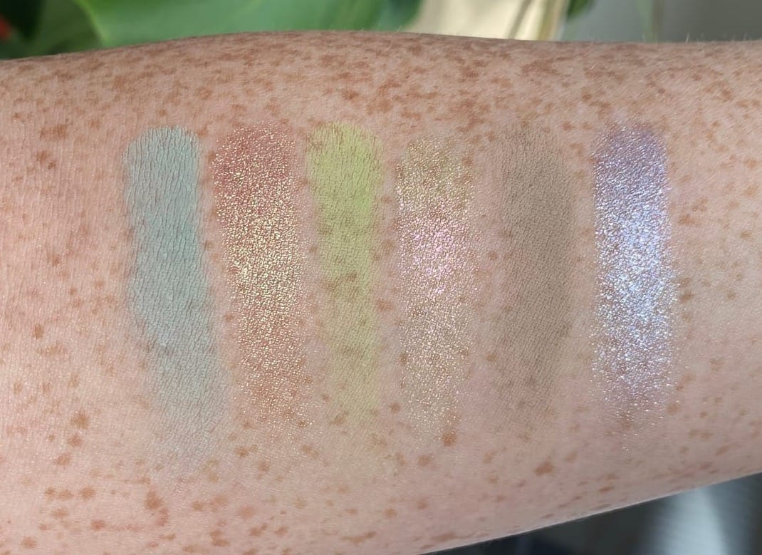
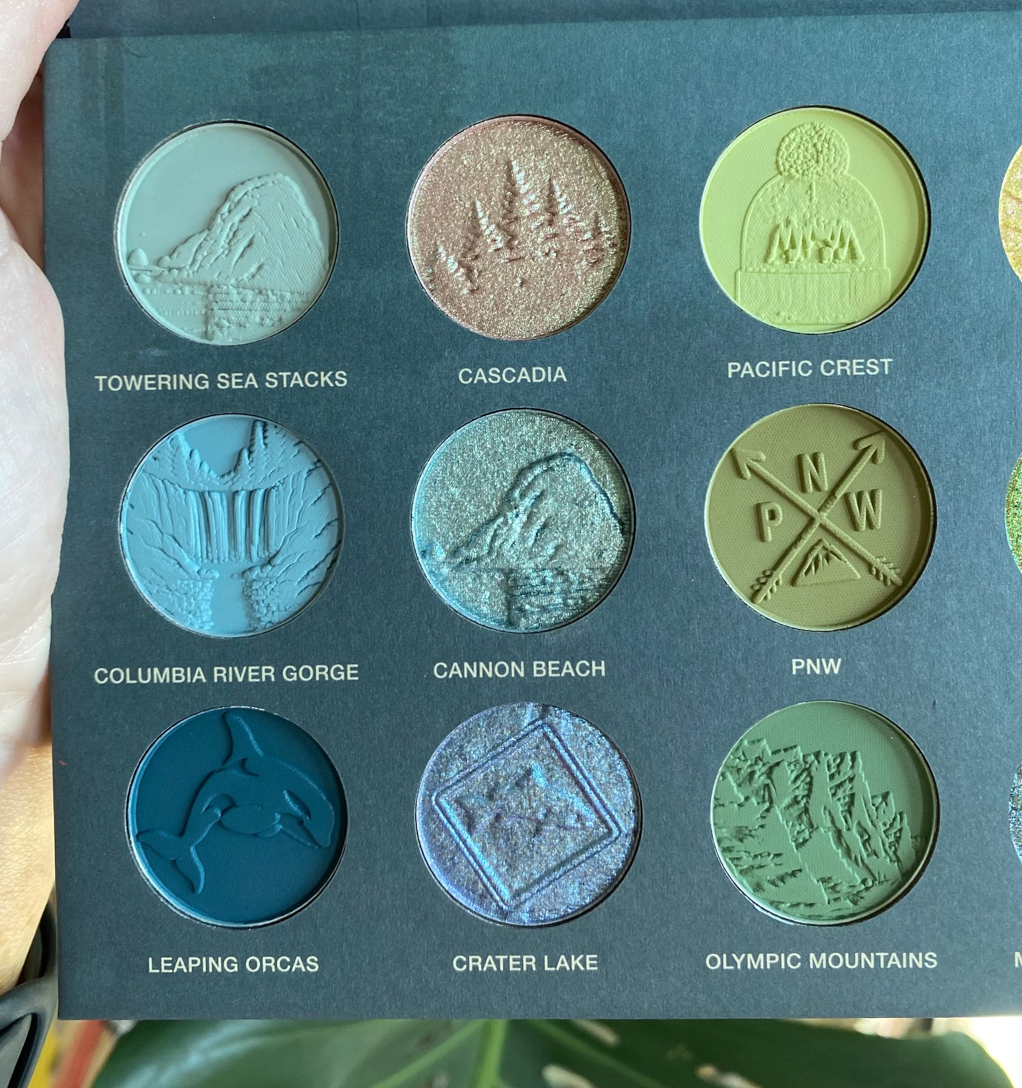
Towering Sea Stacks - Seafoam sage green matte that feel like blending a cloud made of butter. One of the lighter colors in the platte great for an inner corner or under brow moment. Buildable and more intense with primer. This is the color os waves crashing on the friged Pacific Coast.
Cascadia - Champagne gold to green duo-chrome. Great highlight color for eyes or even face. This shadow is named for the area of land from Northern California, to British Columbia, also including parts of Idaho and Montana. Casdadia is the central idea, rooted in "bioregionalism,"making a case that bioeconomic boundaries are a better basis for governance than current state and provincial lines. It's kinda cool.
Pacific Crest - Pastel electric green. My favorite color in the palette, reminds me of an old Lime Crime shadow I used to own. Performs better over primer and blends out smooth. Love this as an inner corner or lid transition. This color is much like the neon lichen which grows in abundance in the PWN forests.
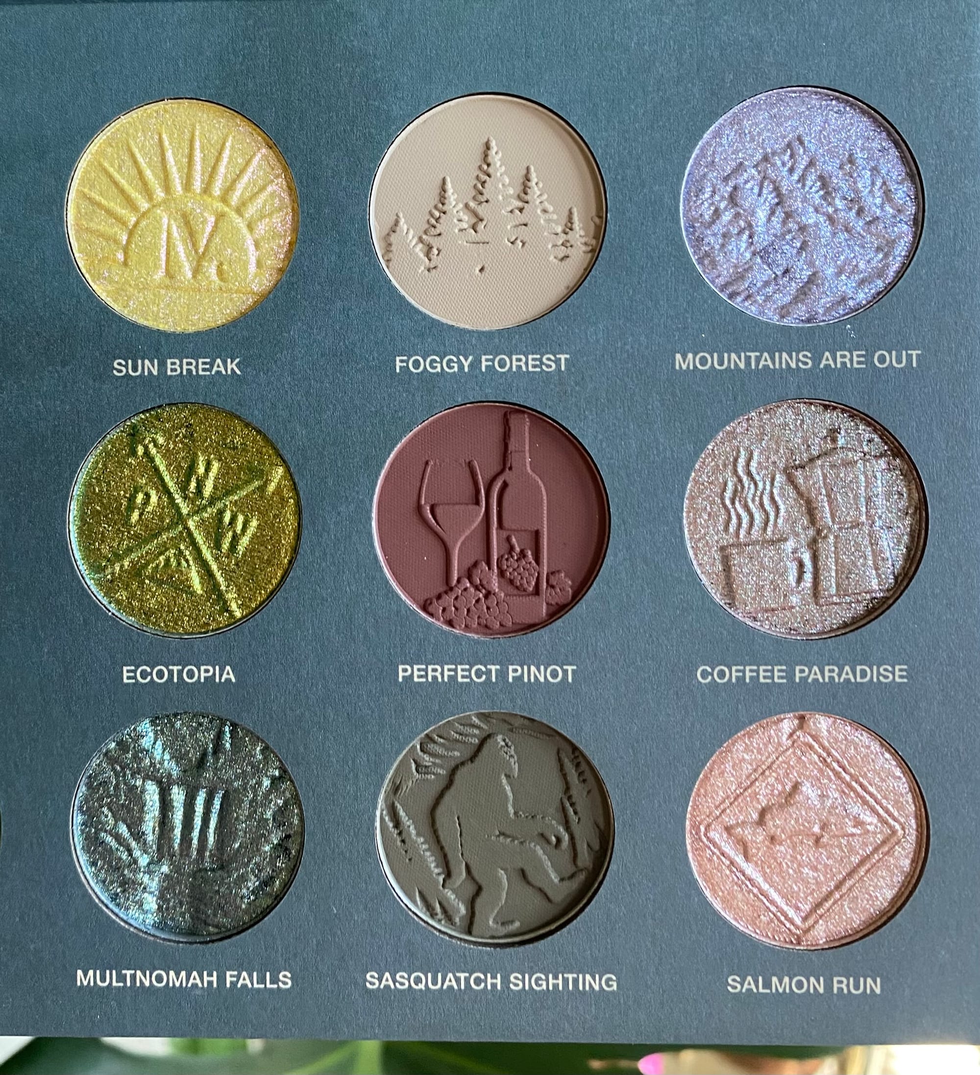
Sun Break - Yellow to pink duo-chrome great for center of the lid accent in a halo eye style. You have to get up early to experience this color an watch the light refracting on the horizon.
Foggy Forest - My other favorite color in the platte oddly enough. I've never seen a taupe like this and it's a fantastic base or transition color. This shade builds particularly well and adds unexpected dimension to a look. This is the color of my perfect morning. Bulbous dew drop on plants and spider webs and so much moisture in the air it softly diffuses the light.
Mountains Are Out - Shimmer baby blue. This one I had an issue with the name because in Seattle we say "the mountain is out" in reference to a clear day when you can see Mt. Rainer.
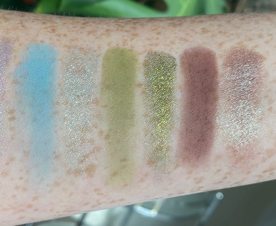
Columbia River Gorge - Perfect powder blue that in my opinion does not match the exact waters of the Columbia River, maybe the white water on the rapids. This shade is a lovely matte easy to wear on the lid or crease.
Cannon Beach - Silver to green duo-chrome that is reminiscent of the expanses of wet sand when standing on the Oregon coastline.
PNW - An absolutely perfect matte olive army green. This color is like a combination of all the colors of every tree in the Pacific Northwest region.
Ecotopia - Multi-chrome teal, gold, green. Ecotopia has a lot going on. the formulas is smooth and easy to apply with a finger or brush. This shade feels like a simple synthesis of all the verdure in the PNW.
Perfect Pino - The only red in the platte which felt a little odd but this has enough brown undertones where it fits with the color story. Also fun fact Washington has a wine region almost as robust as Napa, serving as a popular destination for locals and visitors alike.
Coffee Paradise - Simple shimmer golden brown. An amazing lid color and a pleasure to use. Seattle and Portland had excellent coffee scenes, if you're into that sort of thing.
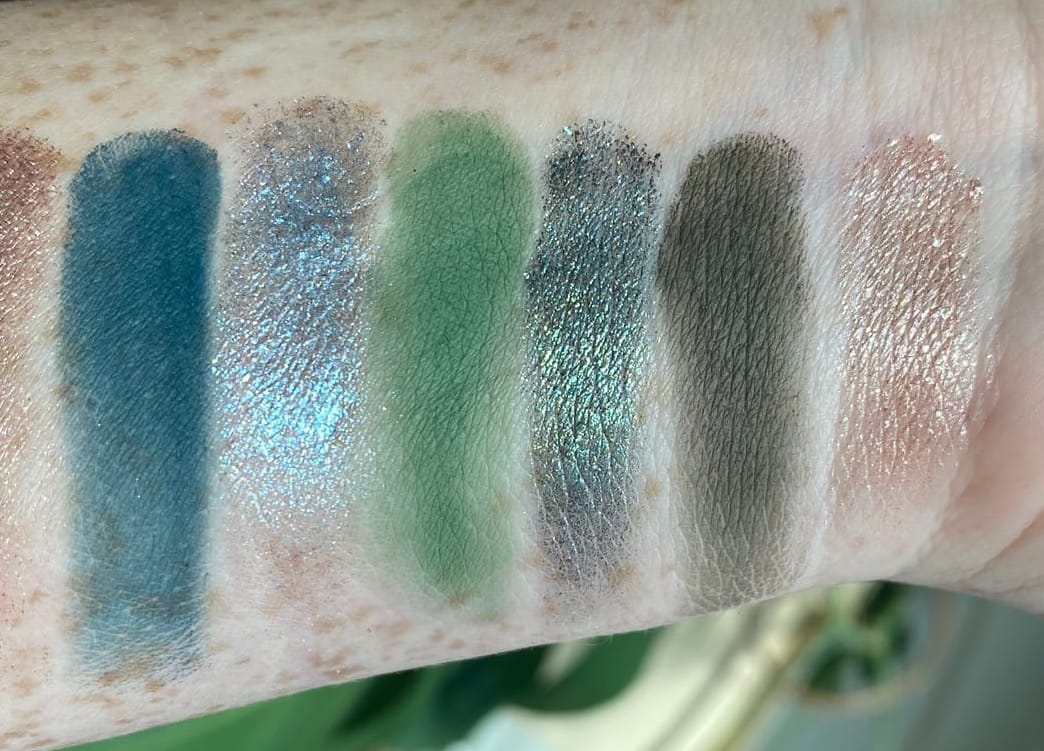
Leaping Orcas - Deep ocean blue matte, the color of the coldest water. Makes a great liner or crease color. PNW is lucky enough to be home to these mythical whales and they are held with sacred regard.
Crater Lake - Blue to lavender duo-chrome, the contrast in this is subtle so it leans more blue. The deepest lake in the United States, seeing Crater Lake on a clear day is an unforgettable sight and a type of blue you will never forget.
Olympic Mountains - Another matte green but more grassy mossy colored. Makes a great color for any part of the eye in my opinion. The Olympic rage is home to North America's most dense temperate rainforests, making this color absolutely appropriate.
Multnomah Falls - Gray to green multichrom with holographic glitter. A really unique color for the palette that feels like the magic of the woods on a rainy day.
Sasquatch Sighting - Matte green brown. Great for cool toned complexions but can also make a good crease color. I didn't know when I moved to Seattle but, the PNW is huge on Sasquatch lore. He's said to live out in the dense forests and whistle in the night.
Salmon Run - Golden shimmer with a touch of pink, This shade is super soft and makes for a great vibrant sparkle accent. the PNW is home to....many many many salmon who make the unbelievable seasonal migration from ocean back to fresh water rivers. Honestly, wow. Salmon are doing the most for the eco system and if we are not mindful of their habitats we stand to lose a lot.
Performance
I loved working with these shadows so much, it actually made me realize that I needed to return my Hung Vanngo palette (which I felt bad about doing.) It doesn't matter if you're using a densely packed shadow brush or a fluffy blending brush or, even your finger. The shadows soften at the edges like melting ice and blend together with little effort. Shimmers, I do recommend first applying with your finger to pack on the color then, it's easy to adjust the shape and diffuse with a brush.
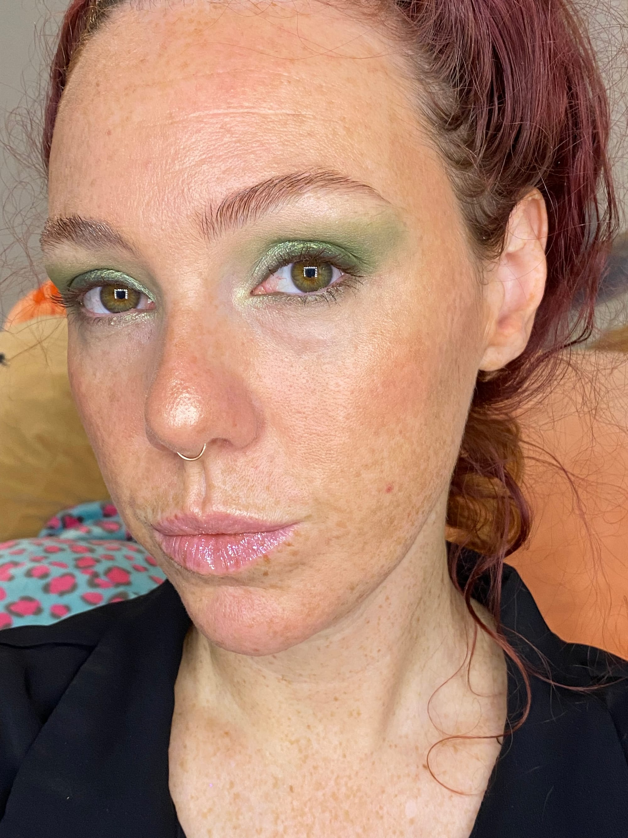
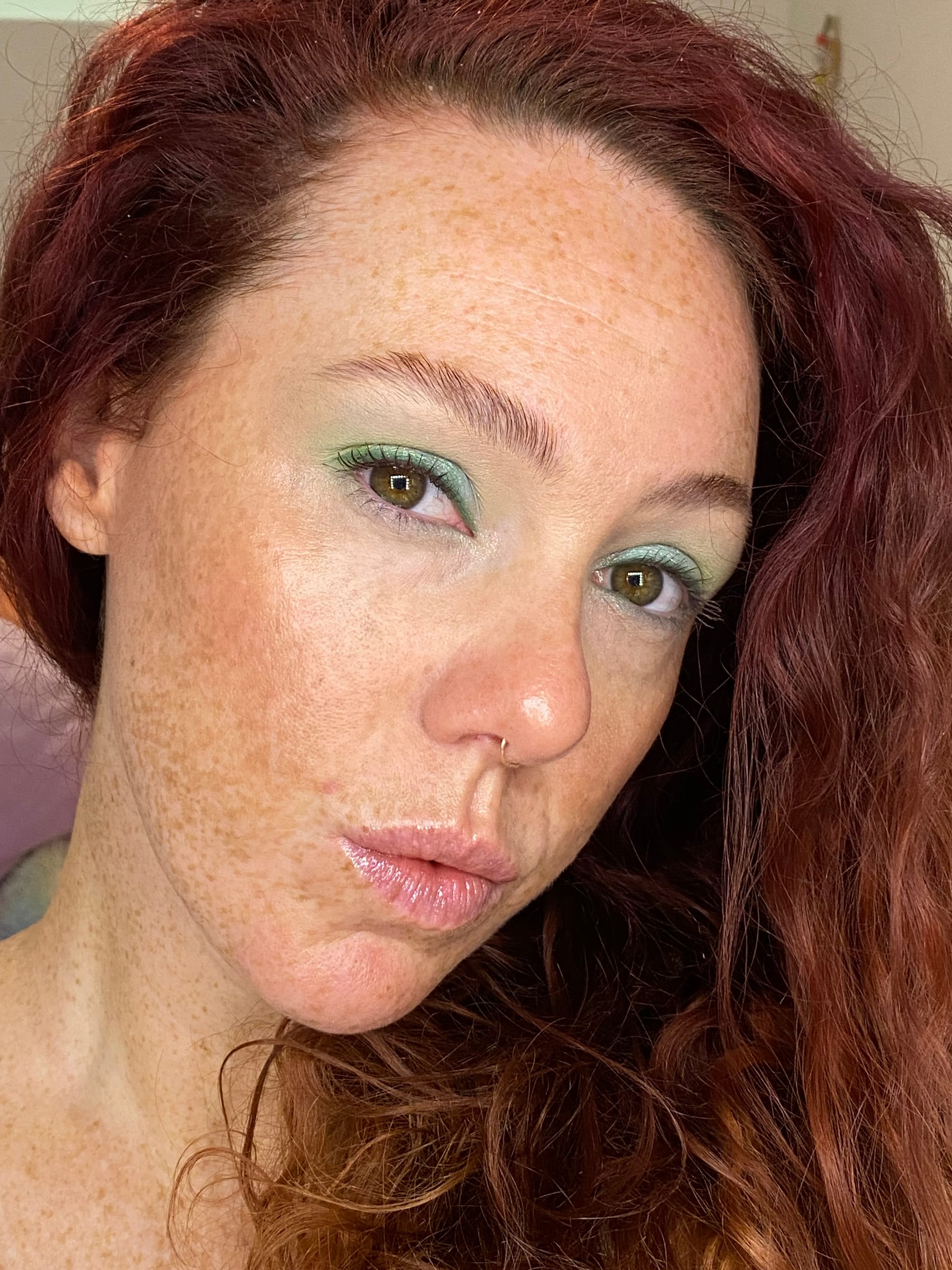
Using PNW, Ecotopia, Salmon Run and Olympic Mountains.
The above look used most the the greens featured for a mono chromatic look. Though I felt some were too close at times they do have their unique values.
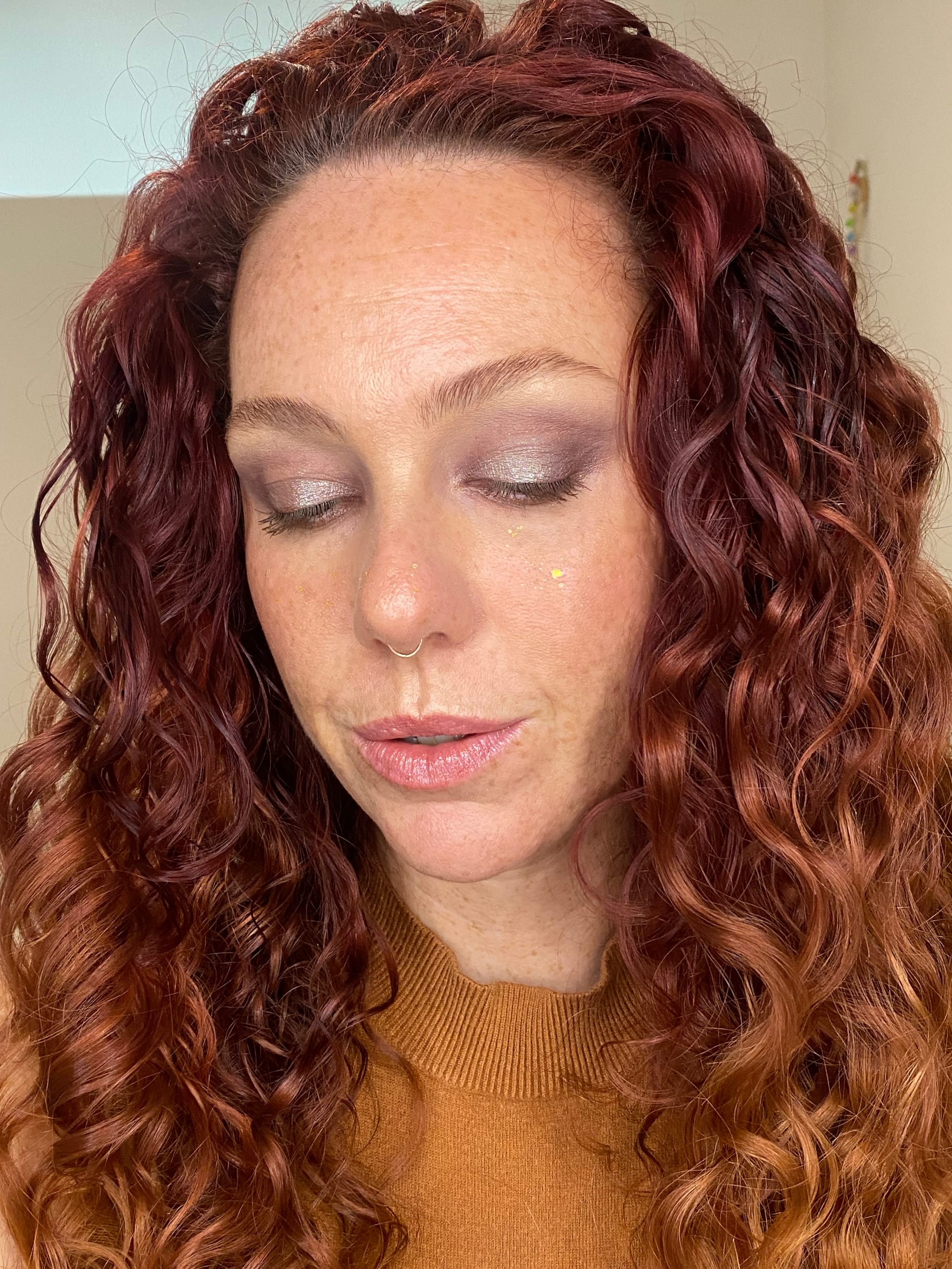
Using Perfect Pino and Coffee Paradise.
Using just two shades you can get a distinctly warm look from an otherwise cool-sit toned palette.
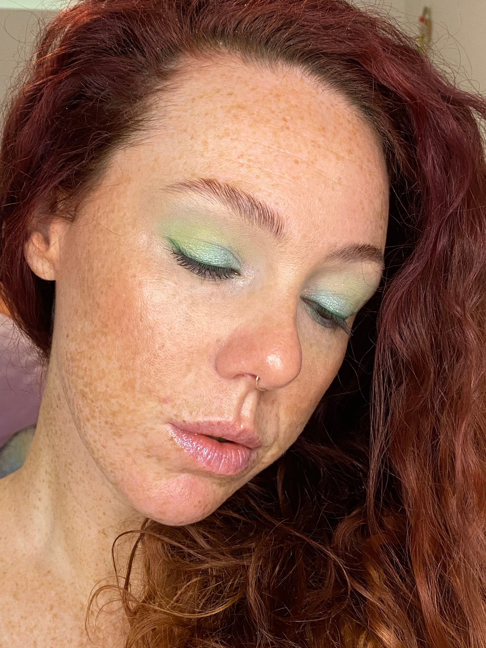
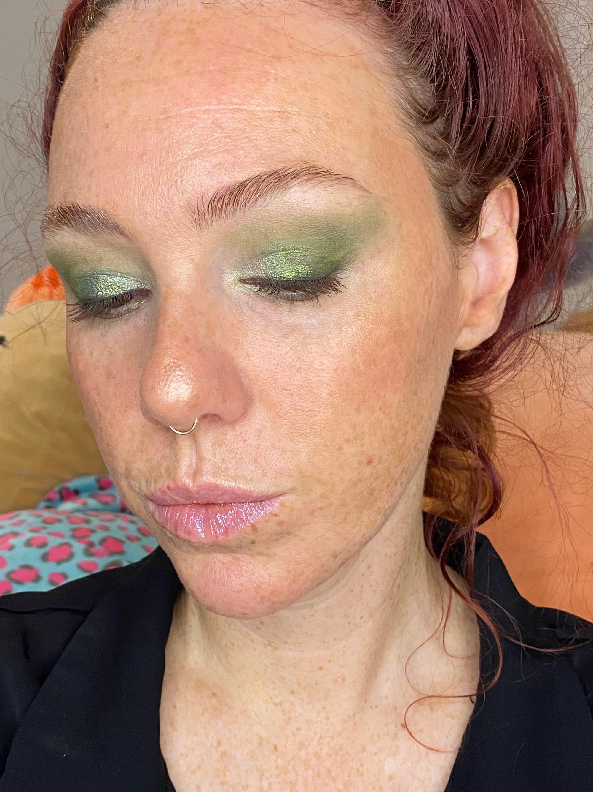
Using Foggy Forest, Pacific Crest, Towering Sea Stacks, Mountains are Out, and Sun Break.
The goal of the above look was to use some of the most unusual colors from the palette. I loved how this turned out.
Overall Thoughts
I am so impressed with the Nomad Cosmetics PNW palette and would consider purchasing another in the future. The value is fantastic and they deliver a diverse selection of colors and finishes. I really appreciate the commitment to the bit when it comes to diving into a cohesive color story and tying those colors into the packaging and shade names, reflecting the essence of the PNW region. For me the creativity presented is really inspiring and immersive. Would absolutely recommend.